Quick answer: Choose CMYK when your box artwork includes photography, gradients or many colors. Consider a Pantone spot ink when a small number of brand colors need a defined physical reference, especially if the closest CMYK simulation is visibly different. You can also print CMYK artwork with a separate spot ink for a critical accent. None of these choices guarantees that a screen image will match a finished box: approve color on the intended board and finish before bulk production.
For a packaging buyer, the real decision is not “Which system is better?” It is which elements must match, on which material, by which print process, and against which approved sample? This guide turns that question into a specification you can send to suppliers. If you are still preparing the artwork itself, first review our folding-carton dieline and artwork checklist.
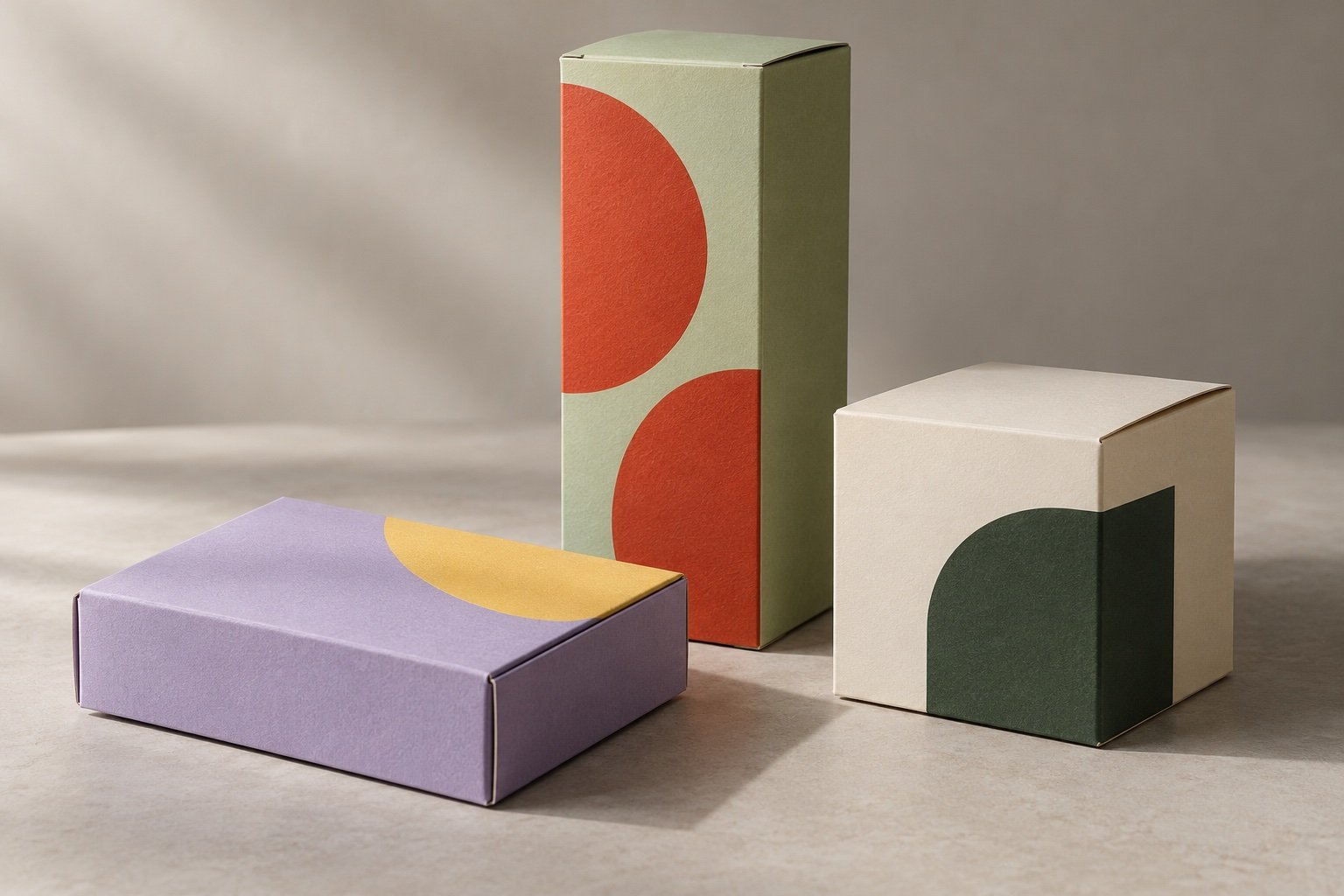
CMYK and Pantone are different ways to put color on a box
CMYK combines cyan, magenta, yellow and black process inks. In conventional four-color printing, the image is separated across four plates. A spot color is a separately specified ink with its own separation; it may replace process inks in a simple design or be added to a CMYK job. Adobe’s spot-versus-process guidance recommends process color for complex multicolor images and spot inks when a few colors need especially close control. Actual options depend on your supplier’s press and order specification.
| Buyer question | CMYK process printing | Pantone-specified spot ink |
|---|---|---|
| Best starting point | Photos, gradients and artwork with many colors. | A limited palette with one or two identity colors that need a defined printed reference. |
| How color is created | Four standard process inks combine in halftone patterns. | A dedicated mixed ink is specified and printed separately in a conventional spot-color workflow. |
| What can go wrong | An RGB design or out-of-gamut brand color may shift when converted; the result depends on the print condition. | A named ink can still look different on coated, uncoated or colored board, and a digital proof may only simulate it. |
| Quote variable | Artwork coverage, board, run length, press setup and finishing still matter. | Additional ink, separation, setup and press configuration may change the quote; there is no universal surcharge. |
| Approval reference | Approved proof or production sample on the intended stock. | Specified Pantone reference plus an approved sample on the intended stock and finish. |
A useful middle path is CMYK plus one spot color: use process inks for images, then reserve the spot ink for a logo or a large brand-color panel. Ask for this as a separate quote option rather than assuming every press or material supports the same setup. For a product-specific discussion, see our custom folding carton boxes.
Choose by the artwork, not by a prestige label
Choose CMYK first for photographic or multi-flavor graphics
If the design contains food photography, product imagery, subtle gradients or many illustrations, CMYK is the practical baseline. A separately mixed ink for every visible hue would be an inefficient way to build the image. Still, “CMYK” alone is not a complete color brief. Supply the editable artwork, linked images and the intended output profile or printer instructions; ask how any RGB assets will be converted. Adobe’s process-color overview explains why a monitor preview or bare CMYK number is not an agreed physical appearance.
Consider a spot ink for a non-negotiable identity color
If the packaging uses a compact palette and the brand’s distinctive color is more important than photographic flexibility, request a spot-color option. This is particularly worth evaluating when the intended color is outside the achievable CMYK range for the planned print condition. Pantone’s Color Bridge explanation shows why a spot swatch and its closest process simulation are displayed side by side rather than treated as identical. A spot name is a specification, not a promise of perfect reproduction on every board.
Use a hybrid only where the extra control earns its cost
CMYK plus a spot ink can make sense for a photo-led gift box with one critical logo color. It can also be unnecessary: a brand color that looks acceptable in an approved CMYK proof may not justify another separation. Compare both versions on the same dieline, board, quantity and finish. If you are choosing between a compact retail carton and a larger presentation format, our custom rigid boxes overview can help frame the structural decision separately from the color decision.
One-color spot artwork 1
Four-color CMYK artwork 4
CMYK + one spot accent 5
Counts describe color separations in the stated conventional-print examples, based on Adobe’s separation guidance. They are not prices, quality scores or a prediction that five separations cost 25% more than four. Coatings and special processes may add other steps.
Why the same color reference can look different on another box
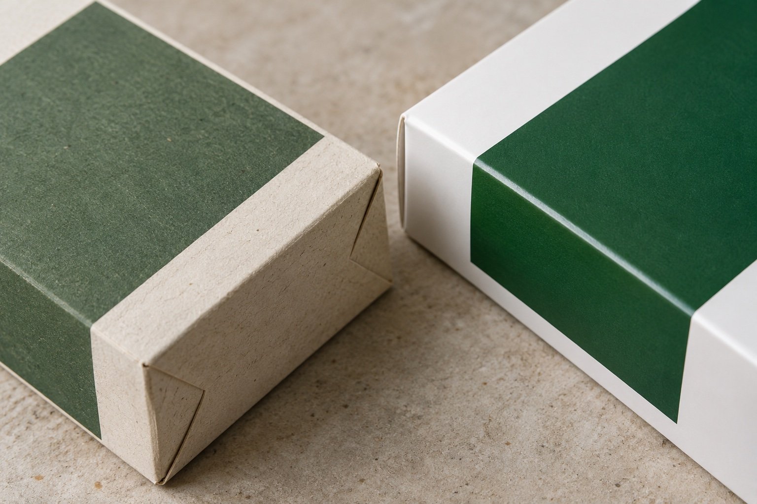
Paper is part of the color system. Pantone explains that C and U suffixes identify coated and uncoated guide stocks, and that the same ink can appear quite different on them. A kraft-look board, bright white coated board and textured uncoated wrap do not give a color the same background or surface. The final lamination or coating should also be included in the sample you approve.
Do not choose a Pantone code from a phone screenshot and assume the destination carton will match it. Ask for the correct physical guide reference and then a sample on the actual substrate. The printed Color Bridge is useful for comparing a spot color with its closest CMYK simulation, but its paper is a reference stock, not necessarily your production board. For matte, soft-touch and other surface choices, our soft-touch packaging guide covers a related finish decision.
Approve a production standard, not a screen image
A digital mockup answers layout questions. A soft proof predicts a particular output condition if the file, profiles and display are managed. A printed proof or physical package sample lets the buyer judge the actual material and finish. These stages have different jobs; do not let a PDF approval silently become an unrestricted color approval. Adobe notes that monitors emit light while prints reflect it, and that soft proofs remain limited by the monitor and viewing conditions.
Before approval, put the sample under a consistent light source and compare it with the agreed physical reference. If the brand requires instrumental color control, have the buyer and supplier agree which patches, measurement method, viewing conditions and tolerance apply. There is no responsible universal “acceptable Delta E” for every packaging job; PRINTING United Alliance discusses why the answer depends on the color and use case. For offset production, ISO 12647-2 is a process-control standard, but citing its number alone does not define your project’s target or acceptance limit.
Physical proof sign-off checklist
- Lock the substrate: Record the board or wrap stock, surface texture and whether it is coated, uncoated or kraft-look.
- Lock the print method: Record CMYK, spot color or hybrid; ask whether the sample and bulk run use the same production process.
- Identify critical elements: Mark the logo, large solid panels, fine text and images that the team will actually judge.
- Record the reference: Name the correct Pantone C or U code where used, or identify the approved physical CMYK proof and artwork revision.
- Check the finish: Approve color after any lamination, varnish, soft-touch or other surface treatment, not just before it.
- Agree the acceptance method: If measurement matters, define viewing light, device method, target patches and allowable variation together; do not impose an unexplained generic number.
- Retain a control sample: Keep the dated, signed physical approval and the exact file version for reorders.
Color is only one approval item. Fold positions, glue areas, barcode space and box fit also matter. Use our dieline approval checklist alongside this color review so a good hue does not hide a construction error.
Compare quotes without inventing a “Pantone surcharge”
Ask suppliers to price three fully specified routes when the artwork justifies them: CMYK, a limited spot-color design, and CMYK plus one spot accent. Keep the box size, board, finish, quantity and delivery destination identical across the comparison. Adobe notes that each additional spot ink requires its own plate in conventional printing and can increase costs; it does not publish a universal per-box premium. Your real quote will also reflect setup, coverage, spoilage, packing and shipping, so a percentage borrowed from another job is not a reliable planning number.
For a 1,000-unit starting run, setup can matter materially to the unit quote, but the magnitude is project-specific. Ask for tooling and sample charges separately, then compare landed totals for the same specification. Our packaging cost-optimization guide covers the broader cost levers. If the cartons will be packed into separate ecommerce shippers, price that mailer box as another component rather than treating the printed retail carton as its substitute.
RFQ template: what to send a custom box supplier
- Box structure: Folding carton, mailer or rigid box; finished dimensions and the product that must fit.
- Material and finish: Intended board or wrap, coating, lamination and tactile finish.
- Artwork: Editable vector files, linked images, fonts or outlined text, and the latest approved dieline revision.
- Color-critical items: Pantone reference with C/U suffix if relevant, CMYK build or approved print sample, plus what needs a close match.
- Quantity breakdown: Units per size and printed design, including flavors or seasonal variants. YiHongBox standard formal production starts at 1,000 units per size and printed design.
- Proof plan: Ask what the paid physical sample represents, whether it uses the intended process and finish, and how revisions are approved.
- Destination: Ship-to country and postal or ZIP code, desired date and whether to include a DDP option.
YiHongBox provides free structural and artwork-placement guidance; physical samples are charged. Sampling typically takes around 7 days after specifications are agreed, while bulk production typically takes around 30 days after final sample and artwork approval. Those are planning estimates, not a guaranteed delivery date. We can assess DDP quotations for many US, Canadian and Australian destinations after receiving the order details.
Frequently asked questions
Is Pantone always more accurate than CMYK?
No. A spot ink may make a difficult identity color easier to specify and control in a given print workflow, but its appearance still depends on the paper, press condition and finish. A well-approved CMYK result can be entirely suitable for many brands. Judge the actual sample against the agreed reference.
Can a box use CMYK and a Pantone spot ink together?
Yes, where the printer’s process and the material support a hybrid run. It is a common way to keep full-color imagery while giving a critical brand element its own ink. Quote and proof that combination explicitly.
What do Pantone C and U mean?
C refers to coated guide stock and U to uncoated guide stock. They are references for appearance on different papers, not instructions that every custom board will reproduce the swatch exactly. Specify the correct reference and approve the real production material.
Can I approve color from a PDF or phone photo?
Use those for layout discussion, not as the sole physical color standard. Device displays, lighting and color profiles can change what you see. For a color-critical order, approve a suitable printed reference or physical sample and retain it for reorders.
Should I set a Delta E tolerance in the purchase order?
Only if buyer and supplier agree on the measurement method, target patches, lighting or viewing condition, and what happens when the result falls outside the agreed range. There is no single number that fits every color, stock and use case.
What is the minimum order for YiHongBox custom printed boxes?
Standard formal production starts at 1,000 units per size and printed design. Share the quantity of each artwork variant separately; a shared box shape does not automatically combine different print versions into one MOQ.
Make the color decision easy to approve and reorder
Start with the artwork: CMYK for image-rich packaging, a spot ink for a limited palette with a critical brand color, or a hybrid when both needs genuinely coexist. Then remove the ambiguity by specifying the board, finish, reference and proof method. A signed physical standard is more useful to the next production run than a screenshot and the word “Pantone” in an email.
If you are comparing custom box options, request a packaging color and print quotation with your dieline, color references, quantity per design and delivery postcode. We can help define a sample-ready specification before production.